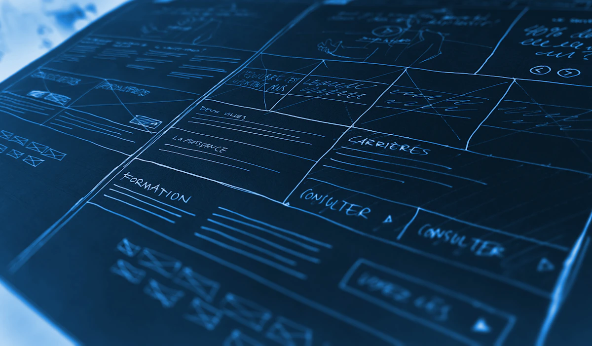
A wireframe is a plain, early sketch of a website: where things go, what each page is for, and how a visitor moves from step to step. It is not a finished design, and that is the point. A rough layout is cheap and quick to change, so a day wireframing can save days of rework.
Start with goals, not pages. In one sentence each, write what the visitor needs to do and what the site needs to achieve. For example, a small site might need visitors to understand the offer, trust the team, and get in touch. Those goals already suggest a homepage: a clear headline, a short explanation, proof, and a contact step.
Sketch the flow before the pages
Next, list only the pages you need. For many small sites, that is a homepage, one or two detail pages, and a contact page. Draw them as boxes, then arrows showing how a visitor travels. If an arrow leads nowhere, or a page has no clear next step, fix the flow before polishing any screen.
Work from the top of each page down: most important message first, then supporting detail, then the next action. Use boxes for headings, lines for text, and crossed boxes for images. Do not choose colours or fonts yet. Grey boxes keep the focus on structure, order, and wording.
For how structured layout choices carry into a finished screen, see Figma Auto Layout Basics for Beginners, which shows how flexible layout thinking works once the structure is set.
Turn the sketch into a testable wireframe
In the afternoon, rebuild your best sketch digitally, just as simply. One frame per page is enough, with real headings and short labels instead of placeholder text. Real words reveal problems filler text hides: a heading too long, a button label unclear, or a section promising more than the page delivers.
Then test it with one or two people who were not involved in making it. Give each person a single task, such as finding how to get in touch, and watch where they look first, without explaining the design. Note every pause or wrong turn: those notes are far cheaper to act on now than after the site is built. A related walkthrough, Prototyping an Interactive Flow for User Testing, shows how to link screens together so a test like this feels real.
End the day with a clear next step
Finish by listing what you learned and what will change: the three most important fixes, in order. Share the wireframe with anyone who must approve it, along with your starting goals, so feedback stays on structure, not colour taste.
A good wireframe does not need to be beautiful. It needs to be clear, honest enough that problems show up early, and easy to change. That is a solid day of work. For habits that keep it easy to find later, read Organising Figma Files So a Team Can Find Anything before the file grows.