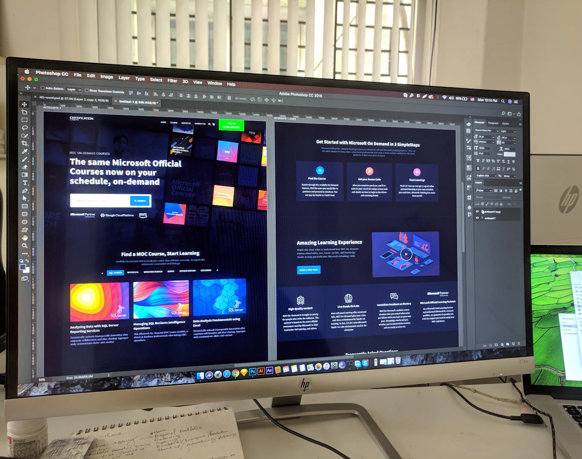
A layout grid is a set of invisible guides that helps you place elements consistently across screens. Without one, spacing drifts: a card sits a few pixels further left on one page, a heading starts somewhere else on the next, and the whole product starts to feel uneven even when nobody can say why. With a grid, you still make the creative decisions, but alignment, margins, and gaps stop being guesses. This guide shows how to set up a grid in Figma and use it without letting it box you in.
Choose columns, margins, and gutters first
Open the frame you are designing for and add a layout grid from the right-hand panel. For a typical desktop page, twelve columns work well because twelve divides neatly into halves, thirds, and quarters. Set a margin that gives the content room to breathe at the edges, often between 24 and 64 pixels depending on the screen width, and a gutter of 16 or 24 pixels between columns. For mobile, four columns are usually enough, with smaller margins and gutters. The exact numbers matter less than using the same numbers on every screen. Write them down, reuse them, and your layouts will start to feel related even before you add colour or type. If you are sketching the page structure first, start with a wireframe and apply the grid to that before adding detail.
Place elements on the grid, then break it on purpose
Start by aligning the main blocks, such as the header, hero, and content sections, to the column edges. Text blocks usually span several columns, images sit within columns rather than floating between them, and cards line up with their neighbours. Once the structure is solid, you can break the grid deliberately for emphasis: a full-width image, an overlapping card, or a headline that stretches beyond its column can all work, precisely because the rest of the page follows the grid. The difference between a mistake and a deliberate break is intention. If you cannot explain why an element ignores the grid, align it. Learning Auto Layout basics alongside grids helps here, because frames that resize cleanly keep your grid alignment intact when content changes.
Check the grid at every screen size
A grid that works on desktop will not automatically work on a tablet or a phone, so test each size as you go. Reduce the column count for smaller frames, adjust the margins, and watch for text that becomes too narrow or cards that stack awkwardly. Keep the gutter consistent where you can, and let content reflow rather than shrinking everything to fit. Finally, hide the grid before you share the design, but keep it in the file so the next person can see the structure you used. A grid is a working tool, not part of the finished design, and treating it that way keeps your files clean and your layouts calm.