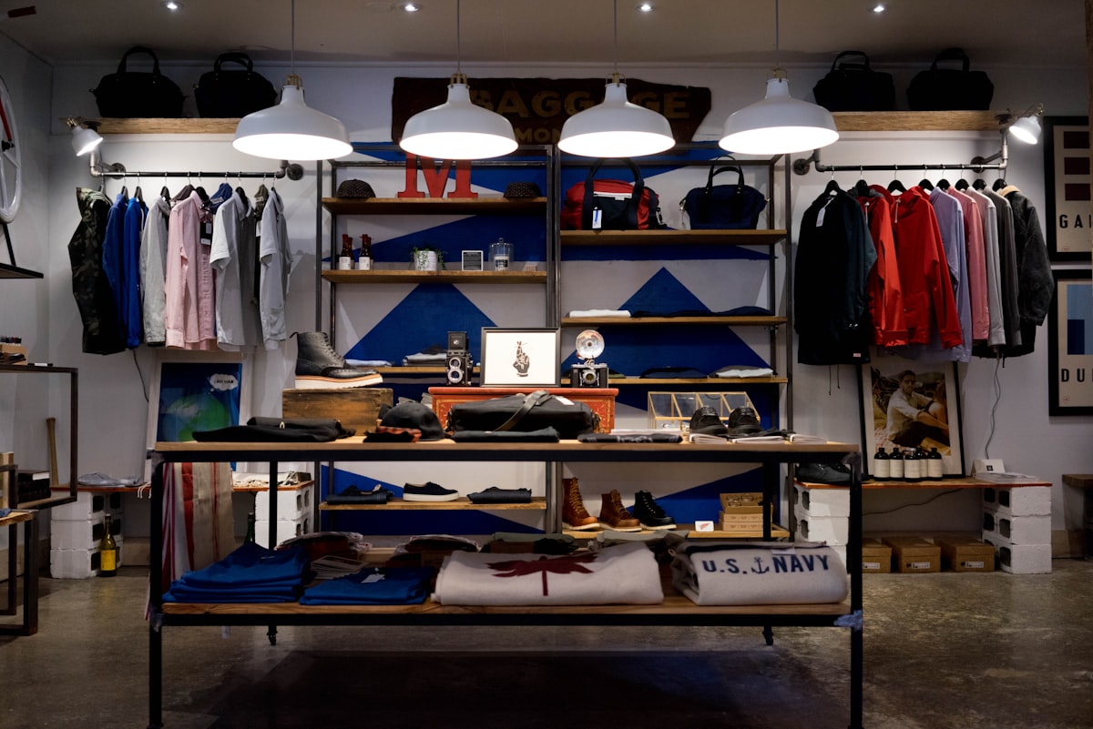
A small business website does not need to be large to be memorable. A compact site often has an advantage: every word, photograph and button has to earn its place. When those choices are made with care, visitors quickly sense who is behind the business, what it offers, and why it deserves their time. Personality here is not decoration. It is the feeling that a real place, with real people and habits, stands behind the screen.
Start with voice, not decoration
The quickest way to show character is through language. A small bakery website, for example, can describe its bread in plain, warm terms, explain when it is baked, and say who will greet visitors at the counter. A repair shop can explain its process in straightforward steps, without jargon or grand claims. That tone matters more than a clever animation, because visitors are deciding whether they trust the business.
Choose a few details and repeat them
Personality also comes from restraint. A small site works best when it picks a small set of details and uses them consistently: one accent colour, one or two typefaces, a repeated shape or a familiar phrase. These details act like a signature. Visitors may not notice them consciously, but they create a sense of place as they move from page to page. Adding a different style to every section, by contrast, makes even a small site feel scattered.
It helps to think about what visitors actually need. Most arrive with a simple question: what does this business do, where is it, and how can they get in touch or place an order? A site with big personality answers those questions early and clearly, then adds character around them. Opening hours, a location and a contact form should never be hidden behind a joke or a puzzle. Character should make the essentials easier to find, not harder.
Keep the human touch visible
Finally, small businesses can show personality by staying human. A short note about how the business began, a description of a typical day, or a simple statement of values can give visitors something to connect with. The key is to keep such notes brief and specific. Vague claims about passion say little, while a concrete detail, such as the morning routine before opening, says a great deal. A focused structure helps too, as shown by one-page websites that do a lot with little.
Handled this way, a small site feels confident rather than loud. It does not try to imitate a large company, and it does not apologise for its size. Instead, it presents a clear offer, in a recognisable voice, with images and details that match. Colour can strengthen that memory, as shown by colourful websites that stay readable. A related lesson in restraint comes from minimalist portfolio websites and restraint, where less is used to say more.