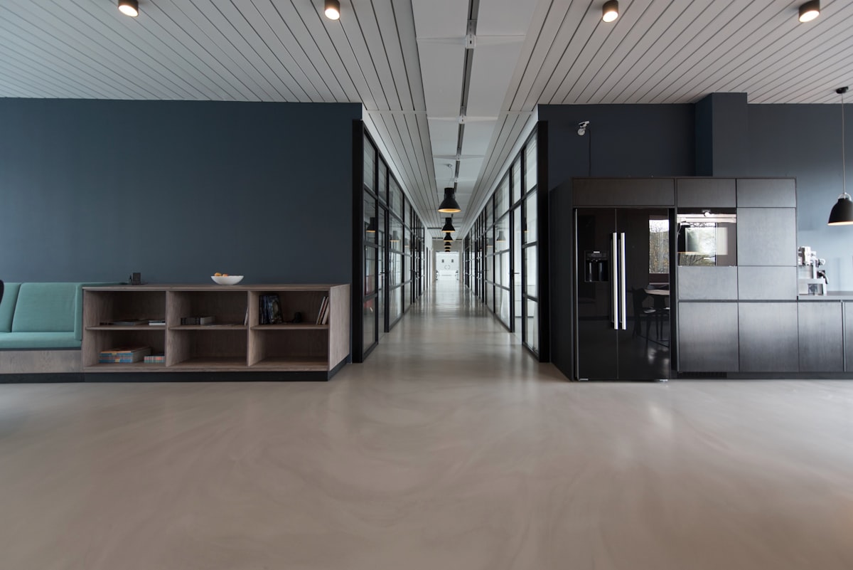
A strong portfolio does not try to show everything at once. It chooses a small number of pieces, gives each one room to breathe, and lets visitors focus on the work itself. A crowded page often hides your best work behind menus, effects, and competing messages. Minimalist portfolio websites teach a useful lesson: clarity is a design decision, not the absence of design.
Restraint Starts With What You Leave Out
Begin by selecting only the work you would be proud to discuss in detail. A short, well-chosen set tells a clearer story than a long archive that visitors must sort through on their own. For each project, keep the description brief and specific. Explain the problem you were asked to solve, the choices you made, and what changed as a result. If a project no longer reflects the kind of work you want, leave it out. The same idea applies to navigation, buttons, and side panels. When every element has to earn its place, the page becomes easier to scan and easier to trust. Readers can find the contact link, understand your focus, and move from one project to the next without getting lost. This disciplined approach pairs well with bold editorial layouts that use strong hierarchy, because both styles depend on deciding what matters most.
Let Spacing and Type Do the Talking
White space is not empty space. It separates sections, groups related information, and gives the eye a place to rest before the next idea. Generous margins, consistent line spacing, and a calm rhythm between headings and body text can make a simple page feel considered rather than unfinished. Type choice matters just as much. One readable typeface for headings and one for body text is usually enough, and a clear size difference between them helps visitors understand the structure at a glance. Colour should follow the same rule. A limited palette, with one accent used sparingly for links and calls to action, keeps attention where it belongs. Images should be large enough to judge properly, with enough space around them.
A Small Checklist Before You Publish
Before you publish, read the page as a first-time visitor would. Can you tell, within a few seconds, what you do and what kind of work you want next? Can you reach the contact page without hunting for it? Does every project still deserve its place? Test the page on a small screen as well. If you are planning a page with a stronger narrative arc, creative landing pages that guide visitors through a story offer a useful contrast, showing when a little more structure and sequence can help. In the end, restraint is not about doing less work. It is about making careful choices, removing what distracts, and trusting good work to speak clearly.