
Web Design & UI/UX
Card Layouts Done Well: When Grids Help and When They Hurt
Cards organise content into neat, scannable units, but a grid of identical boxes can hide what matters. Learn when cards help, and how to keep them clear.
9 article(s).
Cards organise content into neat, scannable units, but a grid of identical boxes can hide what matters. Learn when cards help, and how to keep them clear.

Raw, honest layouts can look striking without feeling unfinished. Here is how to borrow brutalism's boldness while keeping a site usable and clear.
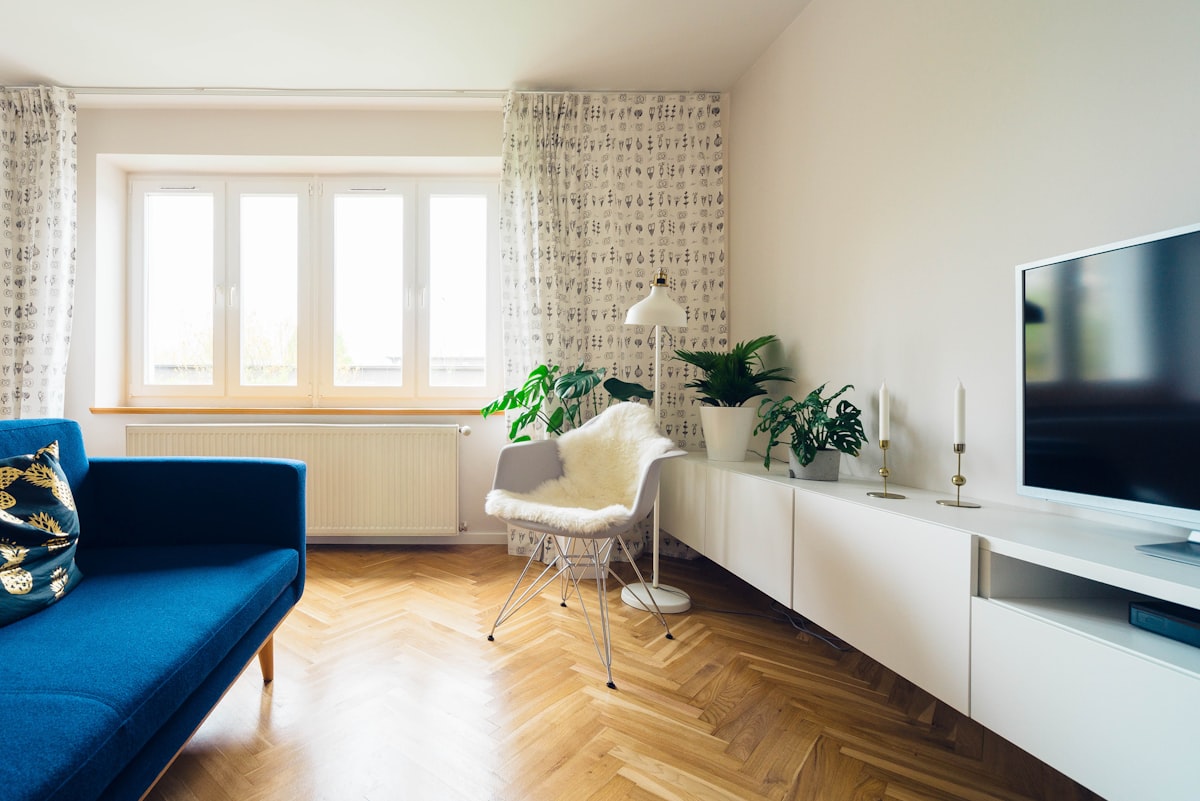
White space is not wasted space: a consistent spacing scale, clear grouping, and steady rhythm help visitors scan a page and find what matters fast.

Bold colour can energise a website without making it hard to read. The trick is a small palette, clear hierarchy and enough contrast to stay legible.

A hero section has one job: make the next step obvious. Learn how a clear message, one action, and honest proof keep visitors scrolling instead of leaving.

Learn how to design a homepage that guides visitors: one clear purpose, sections in the right order, and an obvious next step from the first glance.