
Web Design & UI/UX
Using White Space and Rhythm to Make Pages Easier to Scan
White space is not wasted space: a consistent spacing scale, clear grouping, and steady rhythm help visitors scan a page and find what matters fast.
3 article(s).
White space is not wasted space: a consistent spacing scale, clear grouping, and steady rhythm help visitors scan a page and find what matters fast.

Mobile-first layout starts on the smallest screen: prioritise content, grow the layout in stages, and test navigation on a real phone, not resized window.
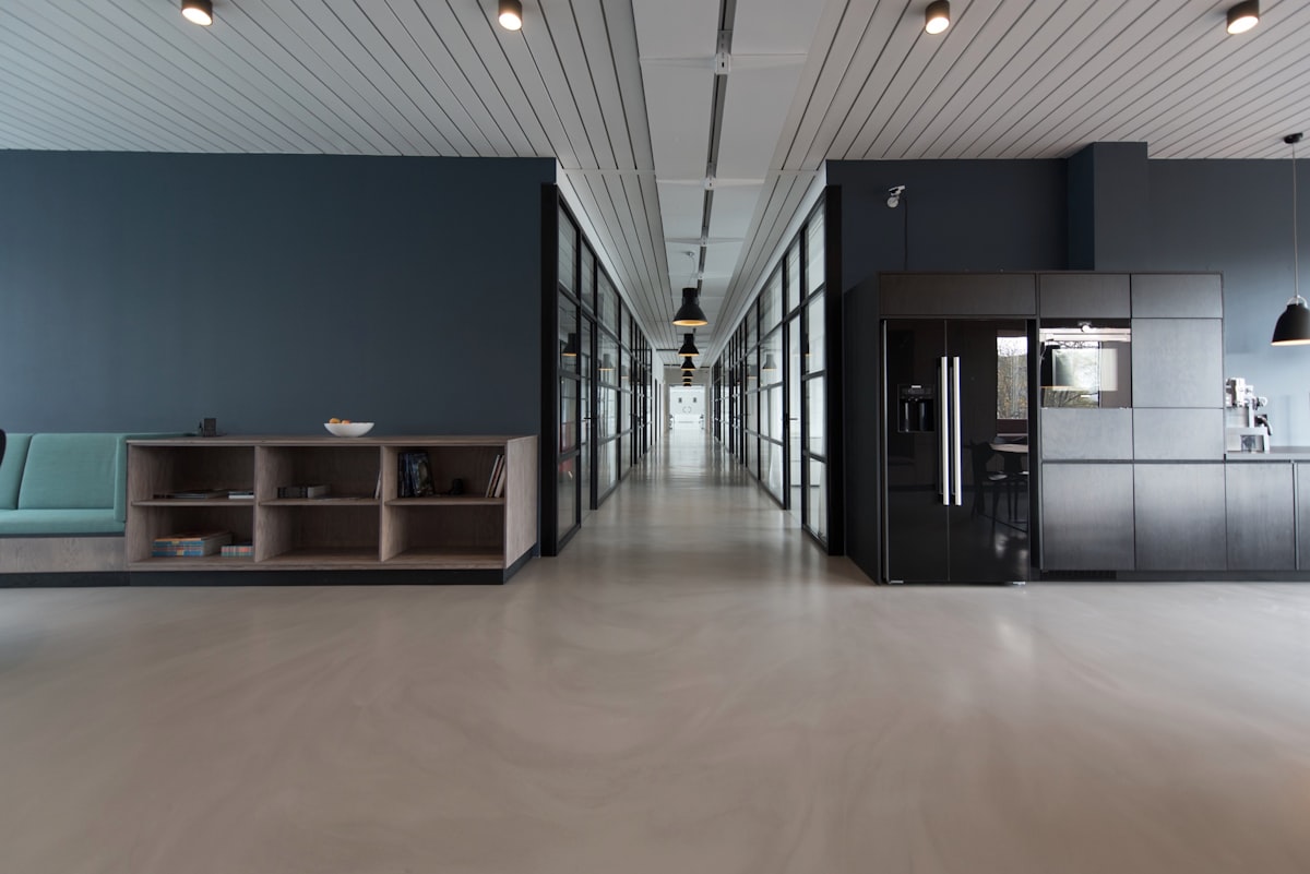
Minimalist portfolios succeed by removing noise, not meaning. Learn how restraint, spacing, and careful choices help the work itself stand out.